UI / Design System
Defined and systematized core UI foundations
- logo design, clear space guidelines, and color variations
- spacing system: paddings, margins, and gaps
- color palette and usage principles
- component architecture, with a light iconography set
- sophisticated Auto Layout system in Figma, carefully defined rules and presets so that component placement and spacing adapt automatically, keeping layouts consistent and responsive
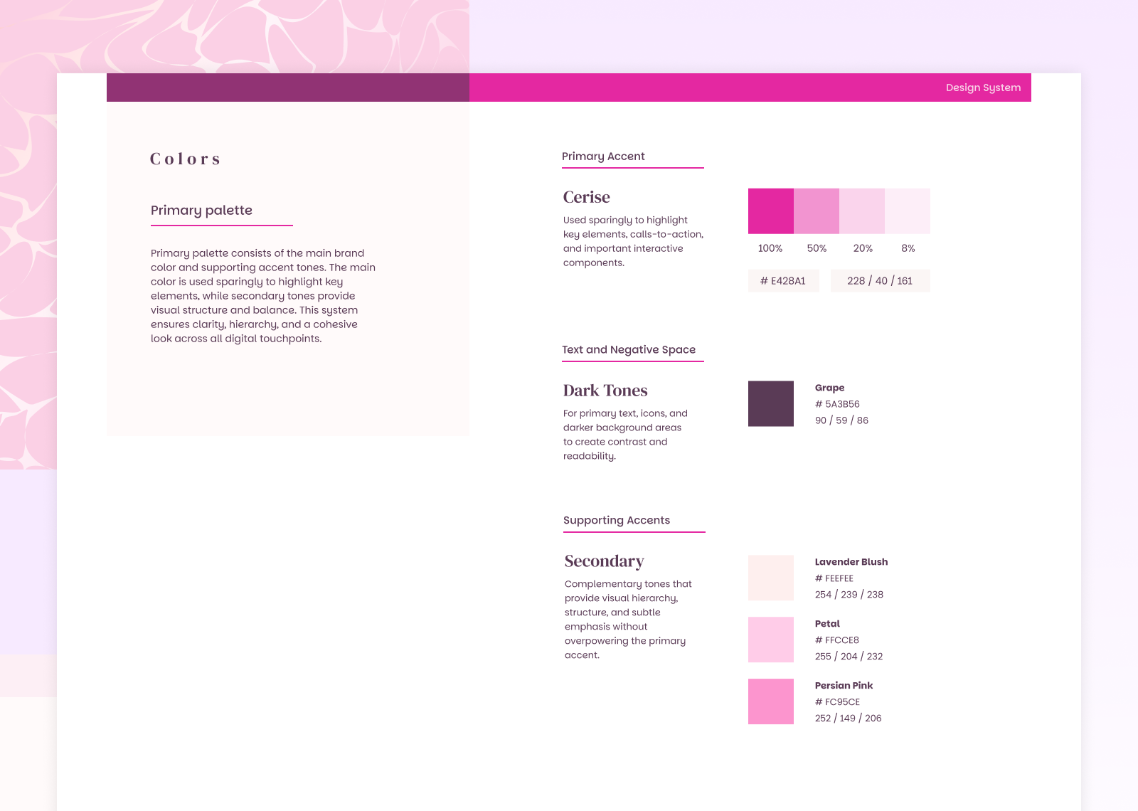
Colors
Primary palette consists of the main brand color and supporting accent tones. The main color is used sparingly to highlight key elements, while secondary tones provide visual structure and balance. This system ensures clarity, hierarchy, and a cohesive look across all digital touchpoints.
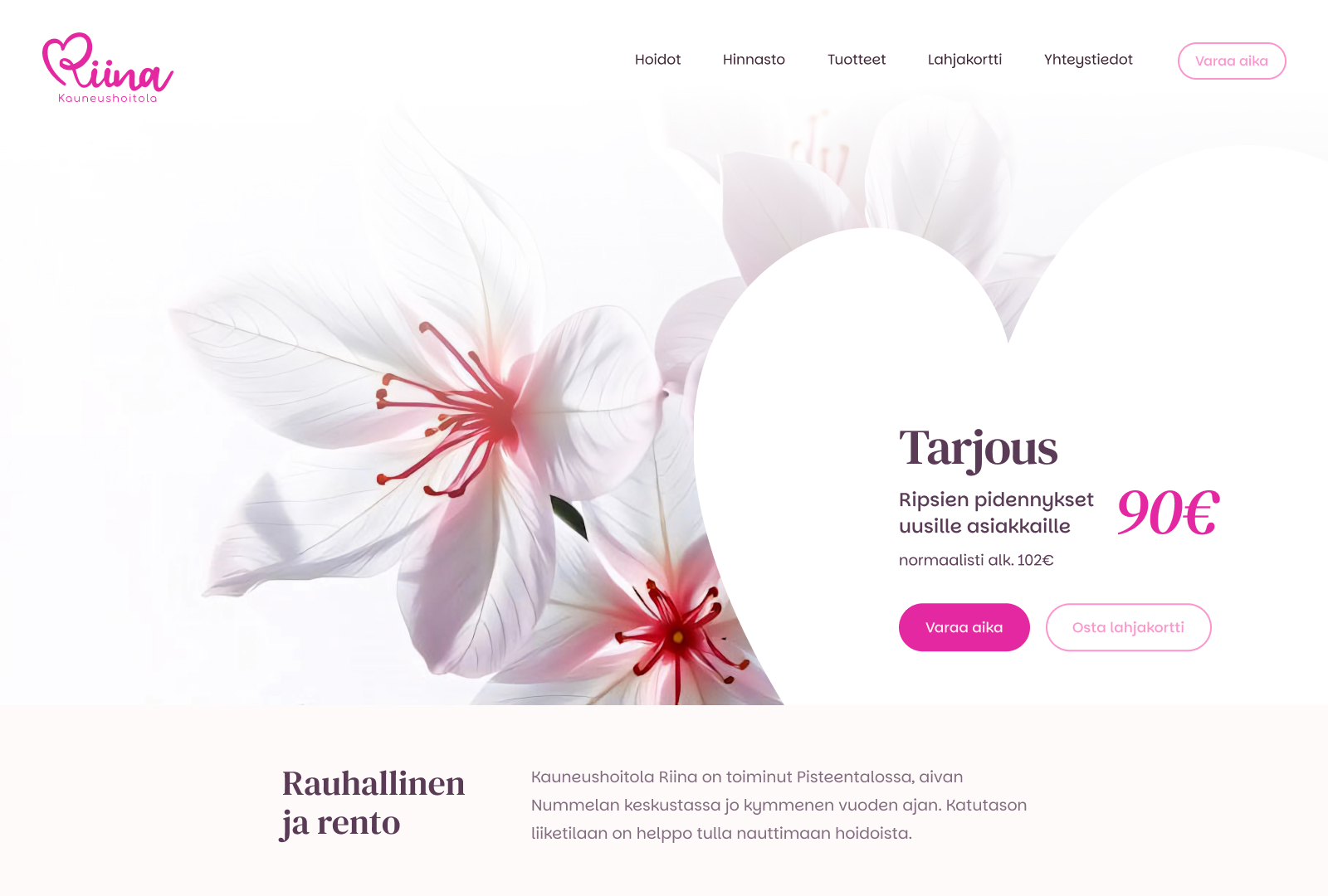
Logo design
The logo is a cornerstone of the brand’s design system, combining a hand-drawn symbol with a soft, flowing wordmark to convey warmth and approachability. The symbol’s curves reflect the client’s caring and friendly ethos, while the rounded Comfortaa typeface in supporting text (“Kauneushoitola”) ensures harmony across all brand touchpoints.
This logo not only serves as a visual anchor but also sets the tone for the typography, color, and promotional systems throughout the design.
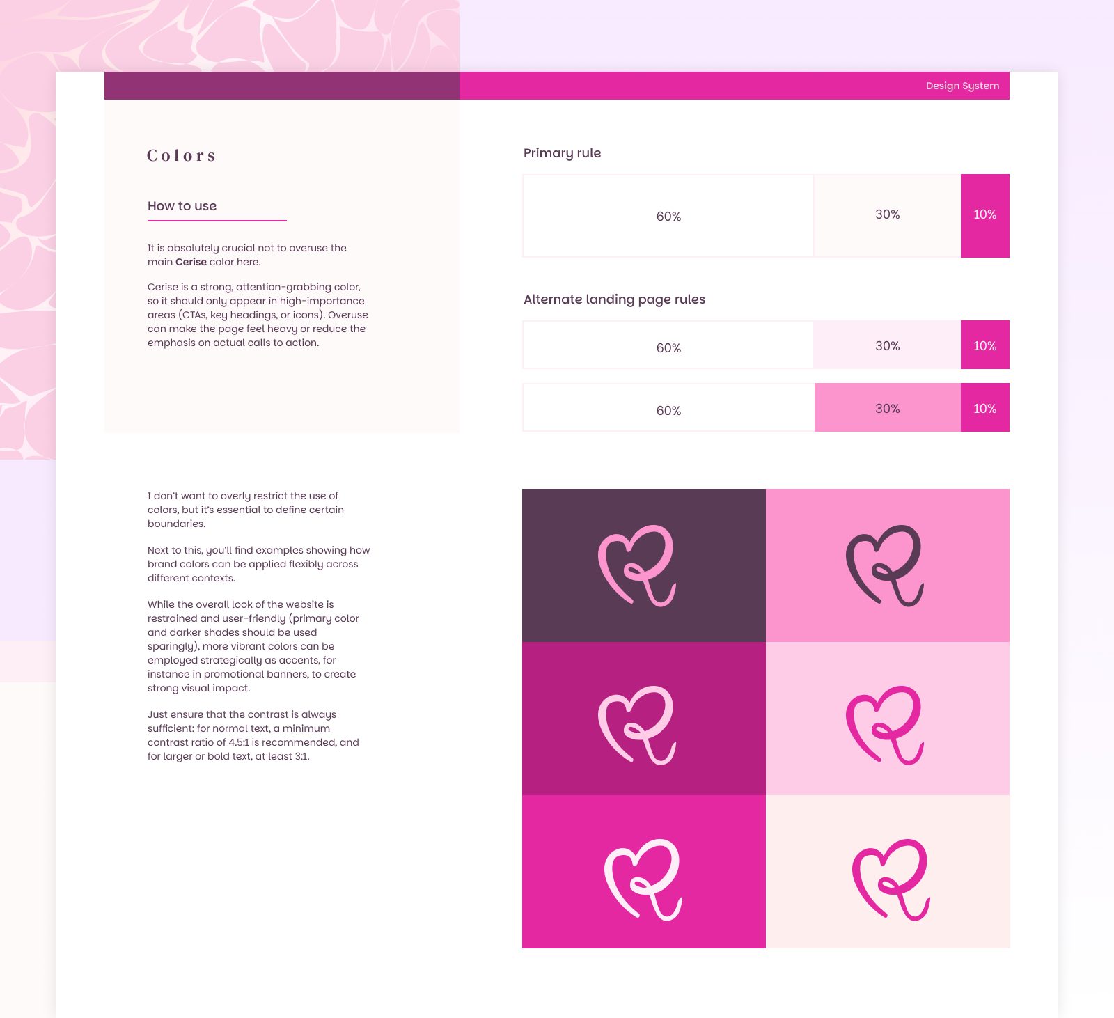
Color & Logomark Usage
The color system balances restraint with impact. Strong accent colors are reserved for high-importance elements like CTAs, headings, and icons to draw attention without overwhelming the page.
Other colors can be applied flexibly across contexts—especially in promotional banners or accents—while always maintaining sufficient contrast for readability and accessibility.
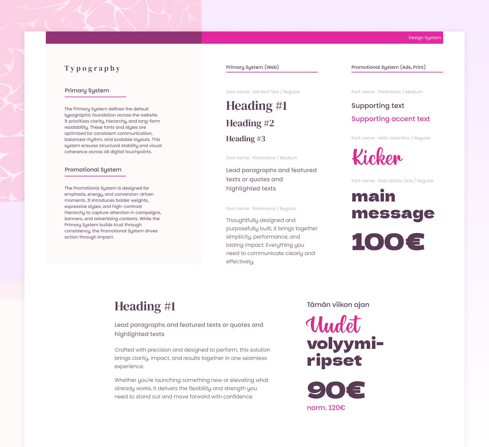
Typography
Two-part System
I created a two-part typography system after realizing that ads and banners often need extra boost and visibility. The Primary System handles default content, keeping readability and hierarchy consistent across the website. The Promotional System is bolder and more expressive, designed to grab attention and make key messages stand out in campaigns and banners.
UX
Gift Cards
A clear and user-friendly gift card ordering option on the website allows customers to effortlessly purchase the exact gift card design they want and receive it instantly by email.
Previously, the beauty salon’s gift cards could only be purchased or collected on-site. This created unnecessary friction and likely led to lost sales during peak seasons. After introducing the online gift card option, it became clear that orders are often placed on the very last possible purchase day—something that would have been impossible without a digital solution.
Booking System
Online booking reduces extra sales and administrative workload while giving customers an easy way to check real-time availability directly from the calendar.
Previously, appointments at the salon were booked by phone or email inquiries. For a solo entrepreneur, this created significant additional administrative work alongside client services. By integrating an online booking system, customers can now manage their own reservations. Most importantly, unnecessary back-and-forth communication has been minimized, as available time slots are clearly visible in the calendar.